NYU Civil Engineering Department
Overview
NYU Tandon's Department of Civil & Urban Engineering offers a wide spread of programs — undergraduate and graduate degrees across transportation, construction management, environmental engineering, urban systems, structural engineering, and more. The problem: prospective students, especially those coming from a non-civil undergraduate background or applying internationally, had no easy way to tell which of these programs they were even eligible for, let alone which one fit their goals. I was brought in to design a tool that could answer "which program is right for you?" directly on the department's website, and it shipped as a live, filterable program finder built in Webflow.
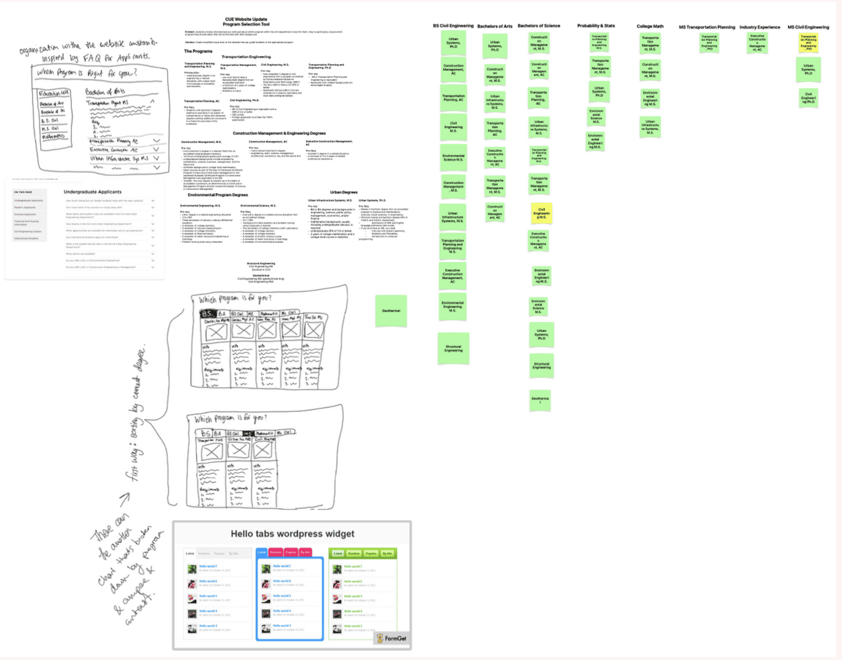
Research & Understanding the Problem
Before I could design anything, I needed to understand the actual eligibility logic — which is more tangled than it looks. A Bachelor's in Civil Engineering opens different doors than a Bachelor of Arts or a Bachelor of Science in an unrelated field, and prerequisites like probability & statistics or college-level math could qualify someone for a program their degree title alone wouldn't suggest. I built out a full compatibility matrix, cross-referencing every program — Transportation Planning and Engineering, Construction Management, Environmental Engineering, Urban Infrastructure Systems, Structural and Geotechnical Engineering, and more — against the backgrounds that made a student eligible for it.
I also audited the department's existing FAQ page, since its accordion-style "Undergraduate Applicants," "Master's Applicants," and "Doctoral Applicants" structure was already organizing similar information, just as static text rather than something a student could filter or search. From there I sketched early lo-fi concepts — dropdown filters and a tabbed layout, inspired by a simple WordPress tabs widget — to explore how a student might narrow down the list interactively instead of reading through FAQ prose.
Initial Design
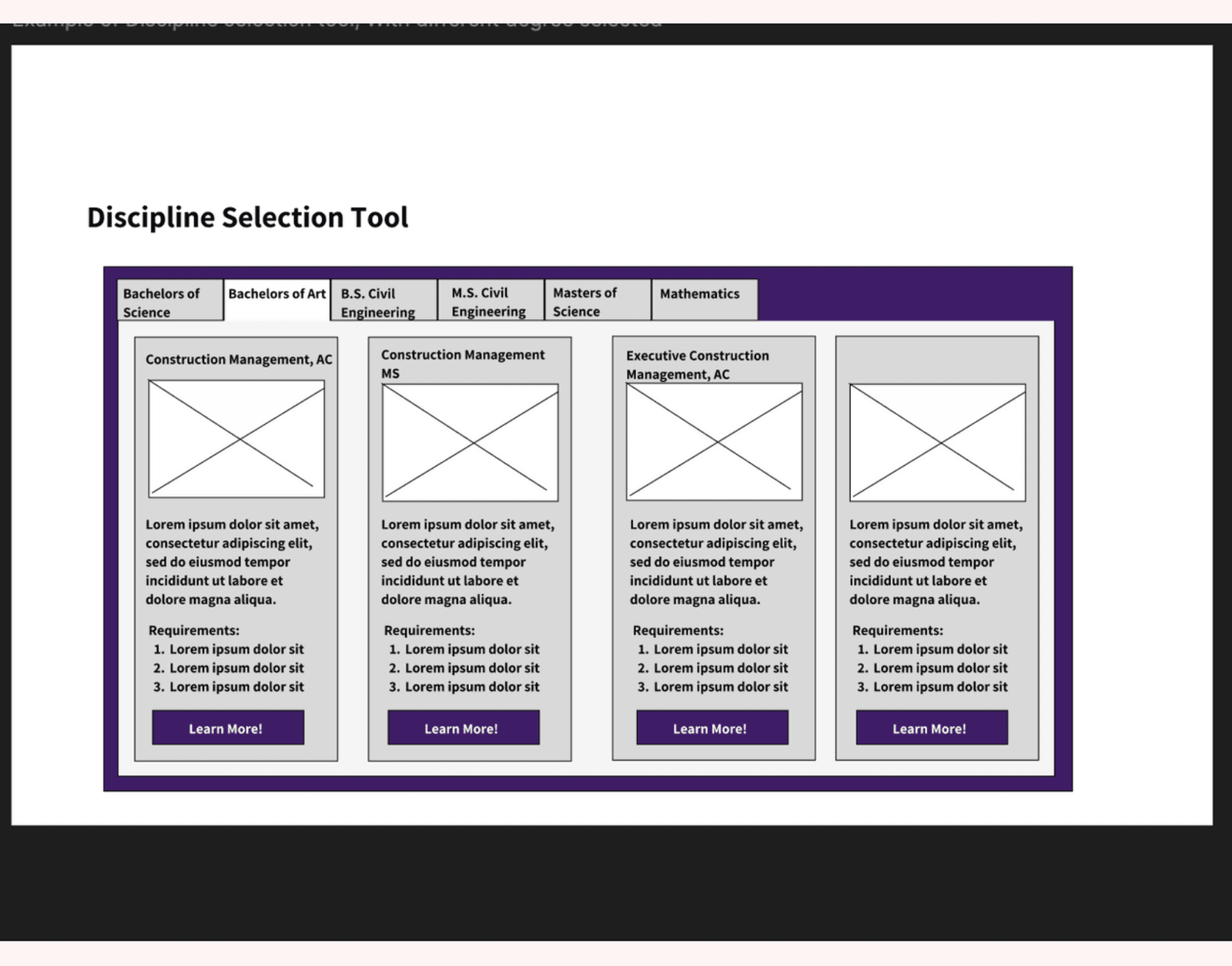
That research became my first real wireframe: a Discipline Selection Tool, organized as tabs by degree type (Bachelor of Science, Bachelor of Arts, B.S. or M.S. Civil Engineering, Mathematics), with each tab surfacing a grid of matching program cards — an image, a short description, a requirements list, and a "Learn More" button.
The "Make It Feel Like Expedia" Pivot
Once I shared this direction, the department gave me a reference point I hadn't expected: make it feel like booking a trip on Expedia. The instinct made sense — Expedia's search-and-filter pattern is one of the most familiar interaction models there is, and a student choosing a graduate program was, in effect, filtering down a list of options the same way a traveler filters down a list of hotels.
I broke down exactly what made Expedia's results page work: a persistent filter sidebar (price, guest rating, amenities) narrowing a scrollable list of result cards, each with an image, key details, and a price. I mapped that same structure directly onto the degree finder — the filter sidebar became Degree Obtained, Area of Interest, and Citizenship, and each hotel card became a program card with its own description and a clear call to action.
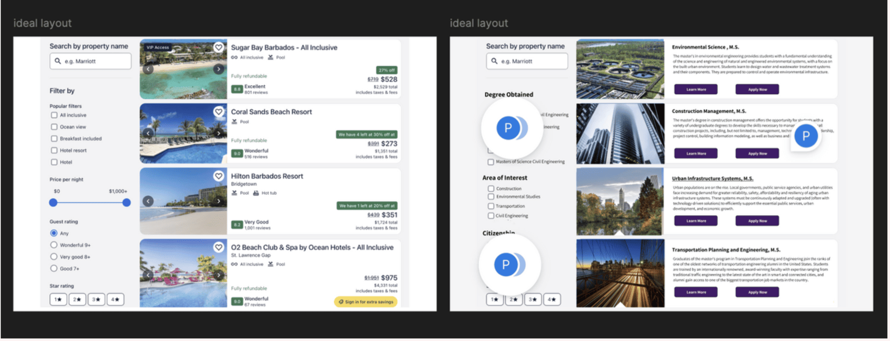
Make it feel like Expedia.
Final Build
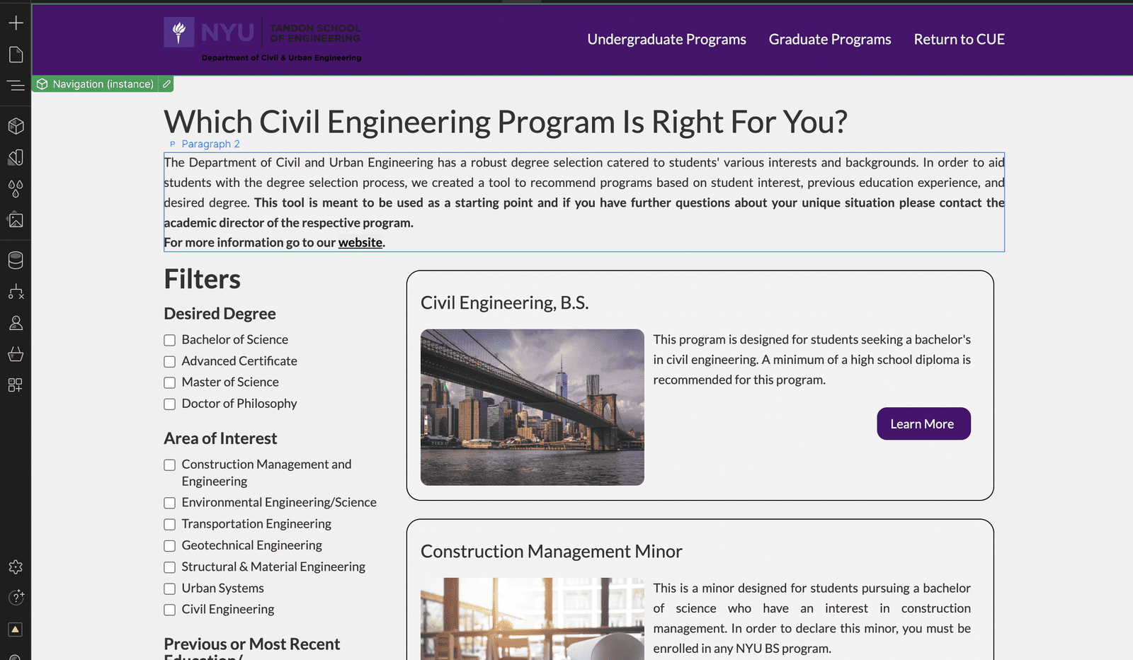
The redesign shipped as "Which Civil Engineering Program Is Right For You?" — a live, embedded tool on the department's Webflow site. A student filters by Desired Degree (Bachelor of Science, Advanced Certificate, Master of Science, Doctor of Philosophy), Area of Interest (Construction Management, Environmental Engineering, Transportation Engineering, Geotechnical, Structural & Material Engineering, Urban Systems, Civil Engineering), and their Previous or Most Recent Education, and the page surfaces matching programs — each with a photo, a plain-language description, and a Learn More link straight to that program's page.
Touch Screen Faculty Directory
Alongside the program finder, the department also handed me a second, unrelated problem: the touch-screen faculty directory mounted outside the department office — a React app visitors use to browse faculty by photo — hadn't been redesigned since it was first built, and it showed.
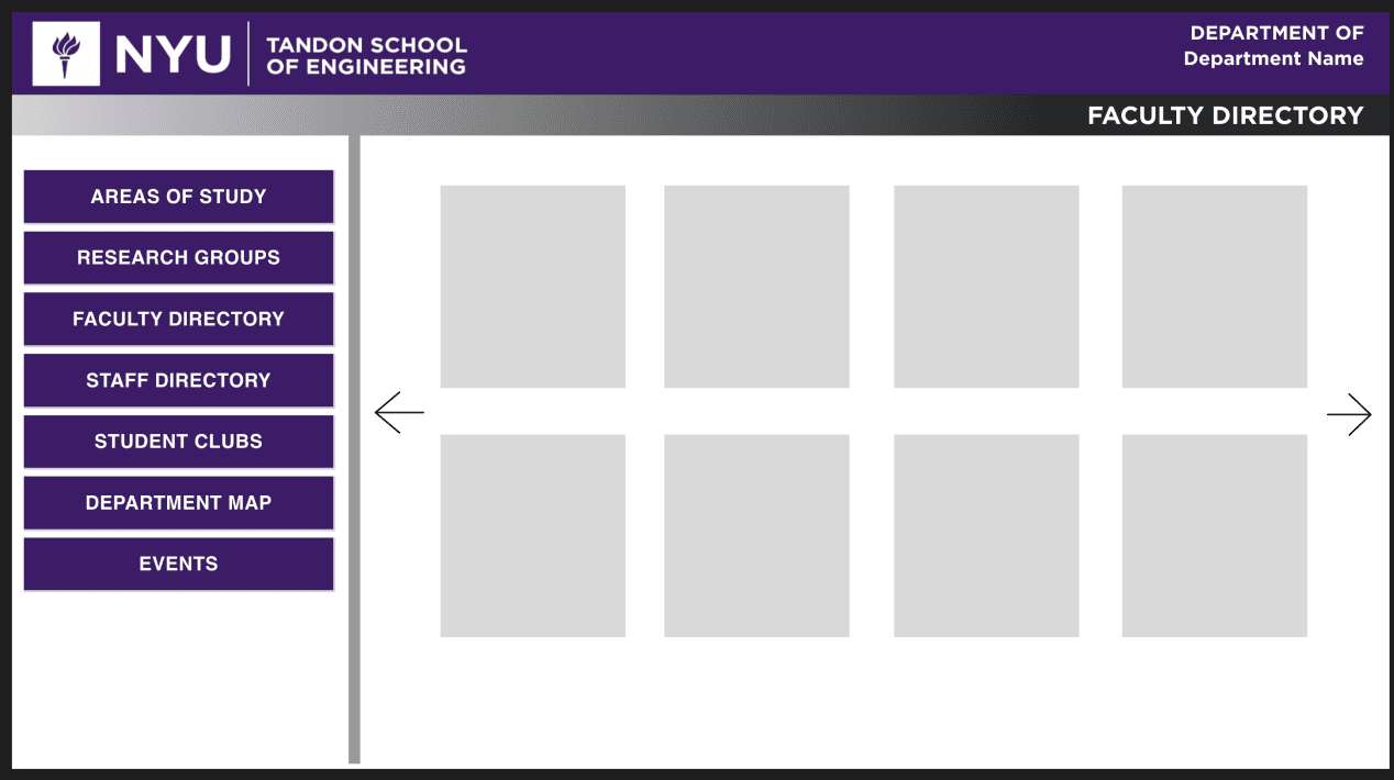
My first pass leaned all the way into NYU's brand — rounded panels, a solid purple frame, pill-shaped navigation buttons — treating "make it feel like NYU" as the obvious direction for something mounted in an NYU building.
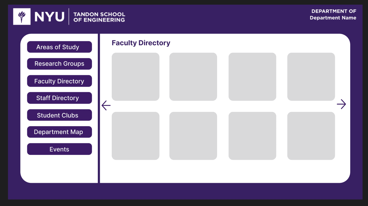
The feedback I got back reframed the goal: the department wanted the kiosk to feel sleek and modern, not like a full-bleed brand wrapper. That meant pulling back — trading the solid purple frame for a single accent bar, dropping the pill buttons for plain text navigation, and letting whitespace and real faculty photography do the work instead of color.
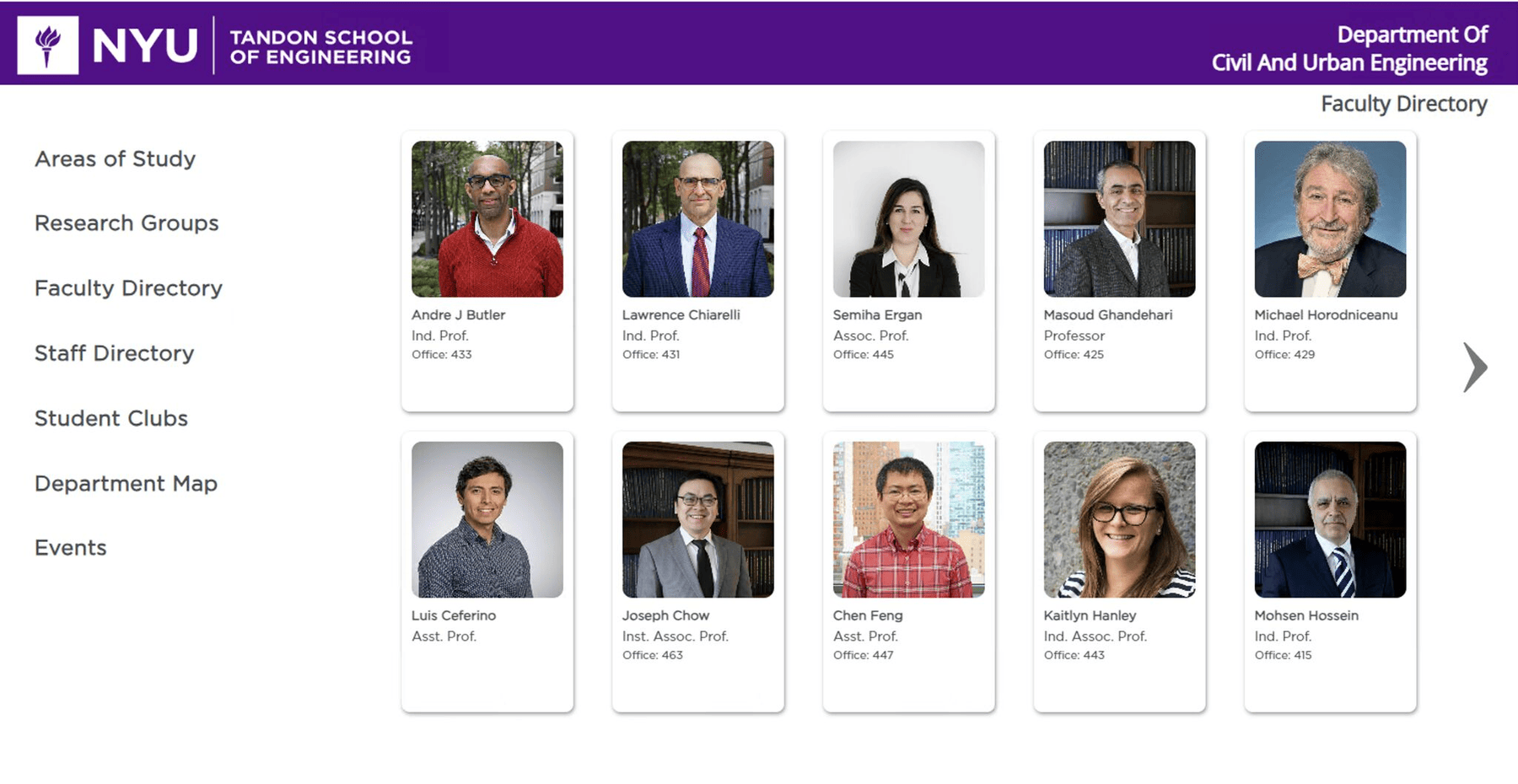
Sleek and modern.
Reflection
What I learned
- A vague creative reference is a design brief in disguise. "Make it feel like Expedia" wasn't a spec, but it wasn't just a vibe either — breaking down exactly which structural elements made that reference work (persistent filters, scannable result cards, one clear CTA per card) turned a one-line note into a concrete, reusable pattern.
- The eligibility matrix was the real design work. Once I had every program mapped against every qualifying background, the interface almost designed itself — the hard part was never the UI, it was making sure the filters mapped onto logic that was actually true.
- Designing something students trust with a real decision is different from designing something they browse. Unlike a hotel booking, a wrong "match" here has real stakes — tuition, years of a person's life — which is why every result card kept a human-readable description and a direct link to talk to the actual program, not just a filtered list and nothing else.
- "On-brand" and "modern" can pull in opposite directions. My instinct on the faculty directory was that anything mounted in an NYU building should look unmistakably NYU. The stronger design lived in the middle: one purple accent bar carries the identity, and everything else — typography, spacing, real photography — is what actually reads as sleek and modern.