Redesigning the YouTube Search Experience
Overview
I use YouTube's search bar constantly, and just as often I leave it not having found what I was looking for. Search for almost anything and the results page hands you back three different things stacked on top of each other: the videos that actually match your search, a "People Also Watched" row, and a "For You" feed of recommendations — with no clear line between them. I wanted to know whether that was just my own pet peeve or a real, shared problem, so I ran a small research study to find out, and used what I learned to redesign the page.
Research
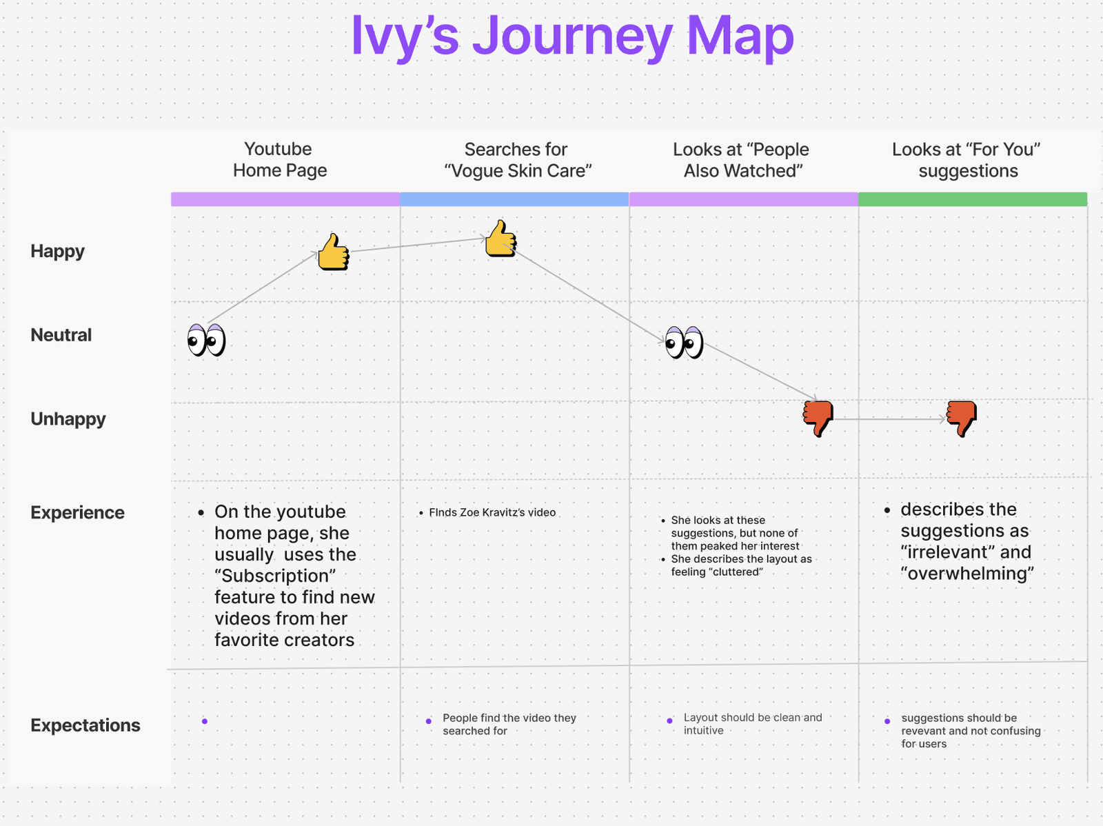
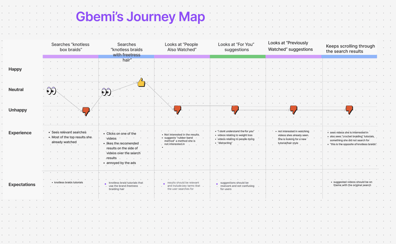
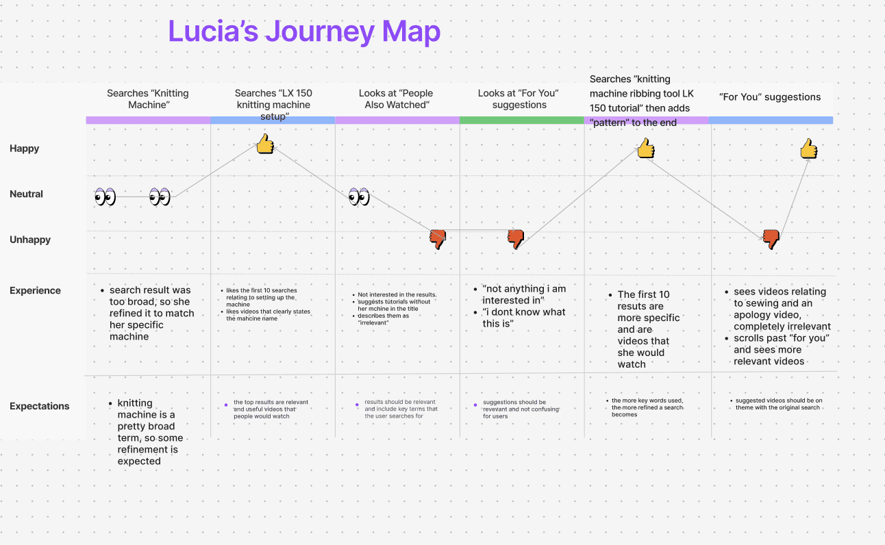
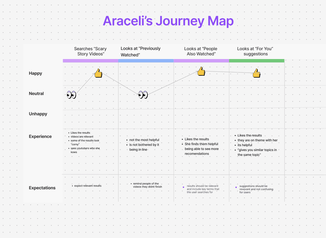
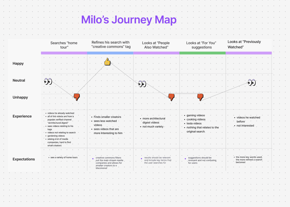
I interviewed 10 students about how they actually use YouTube search day to day, then had five of them walk me through a real search, start to finish, while I mapped their experience as a user journey — what they searched for, how they felt at each step, and what they expected versus what they got.
The five journeys covered very different searches — a skincare video, box-braid tutorials, a knitting machine setup, scary story videos, home tour videos — but the shape of each journey was strikingly similar.
This is the opposite of knotless braids.
What the journeys had in common
Every single journey dipped at the same two moments: "People Also Watched" and "For You." Regardless of what someone searched for, these sections consistently broke the thread of what they came to find — introducing unrelated topics, resurfacing videos they'd already seen, or leaning on an algorithm that, as more than one participant put it, they simply "didn't understand." The searches themselves usually worked, sometimes only after a student added more specific keywords than they should have needed to. It was everything appended below the actual results — treated as part of the same page, with no separation — that consistently cost the platform their trust.
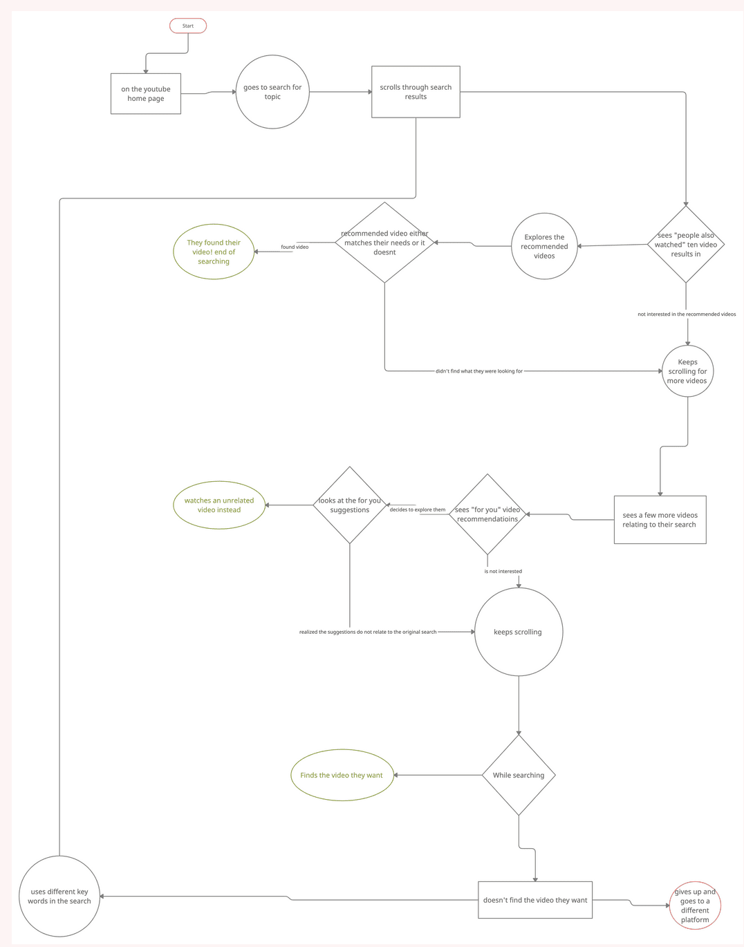
I mapped that repeated pattern into a single user flow to see the whole loop at once: a search leads into "People Also Watched," which either lands or sends someone scrolling into "For You," which either lands or sends them scrolling further — and if nothing lands, they don't abandon YouTube outright, they retype the search with different keywords and run the entire loop again before ever considering another platform.
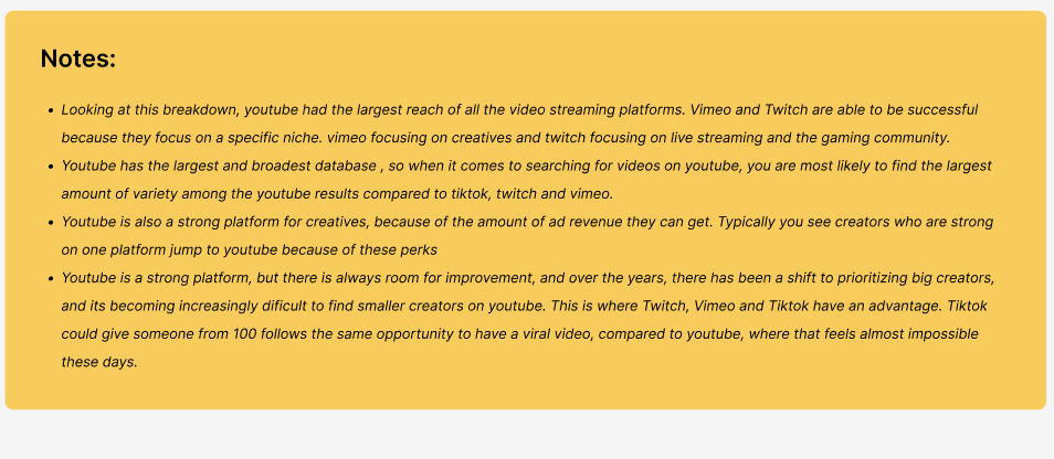
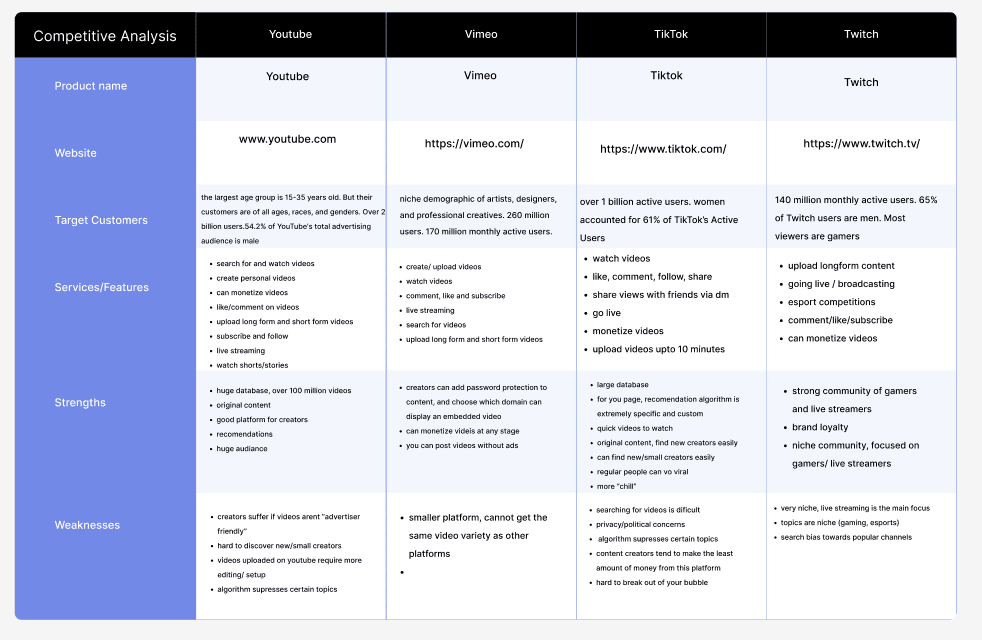
The competitive analysis pointed at why. YouTube's greatest strength — a massive, 2-billion-user library with more original content than any competitor — is also the source of the clutter: with that much to recommend, the platform defaults to showing all of it at once. Vimeo and Twitch, by contrast, stay legible by staying niche. TikTok solves discovery differently: its "For You" algorithm is specific enough, and separated enough from search, that a creator with 100 followers can still reach a wide audience — something participants said felt nearly impossible on YouTube, where the algorithm favors channels that are already large and verified.
The Redesign
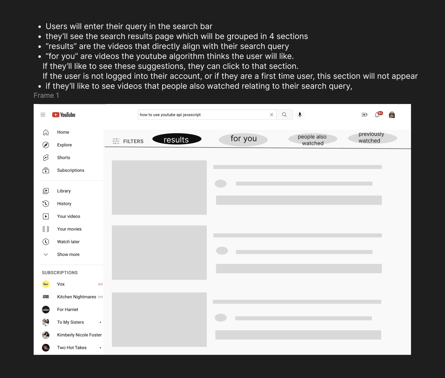
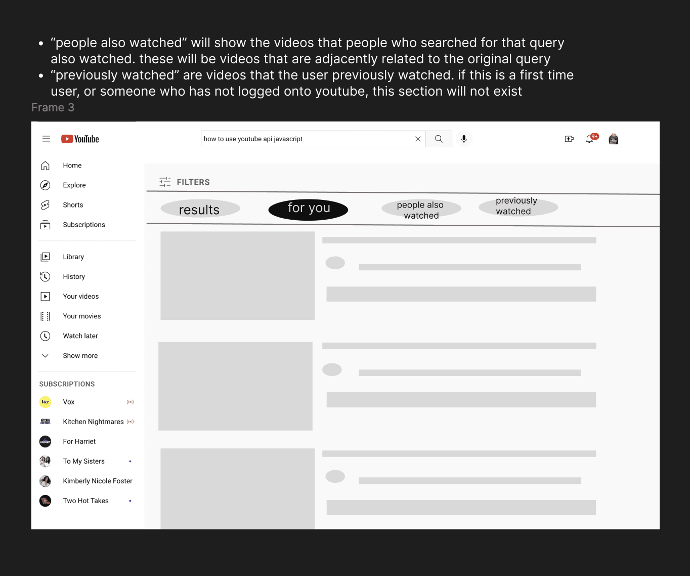
The fix I landed on didn't require inventing anything new — YouTube already solves this exact problem on its home screen, which cleanly separates "Home," "Shorts," and "Subscriptions" into their own tabs. I proposed carrying that same pattern onto the search results page: a Results tab holding only what matches the query, with For You, People Also Watched, and Previously Watched moved into their own tabs beside it — always reachable, but never mixed in with what someone actually searched for.
Low-Fidelity Wireframes
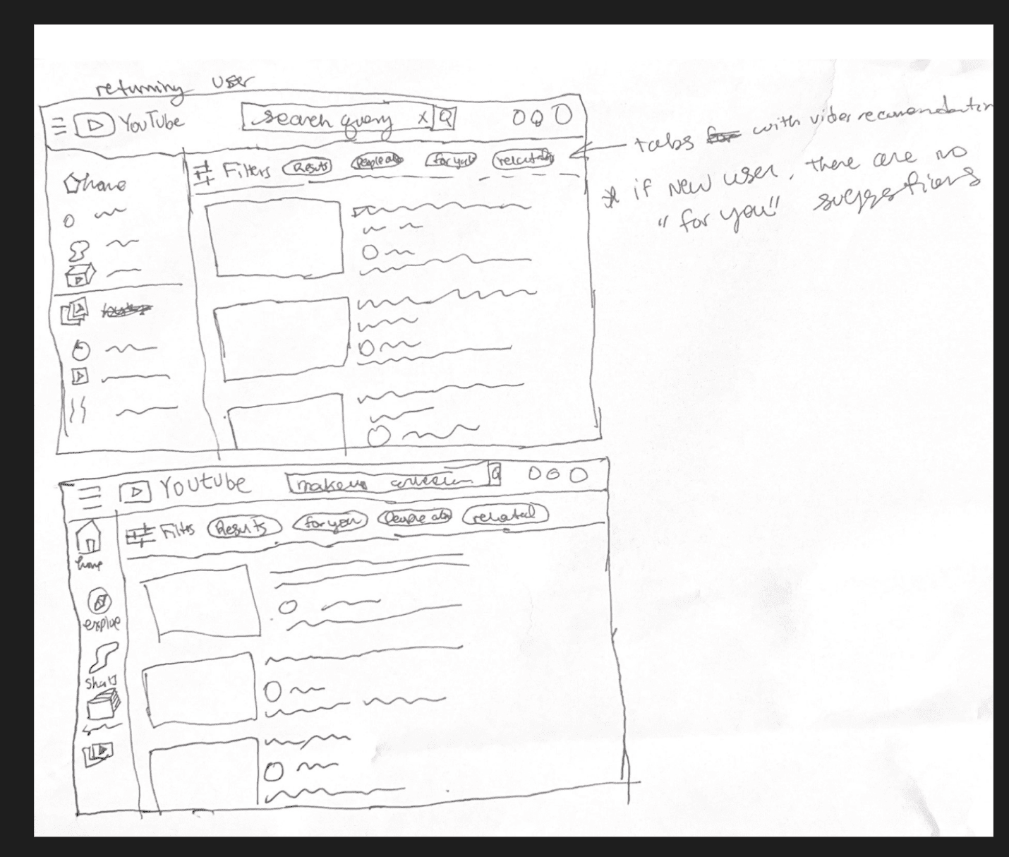
I started by sketching the tab structure directly onto the existing search results layout, working out which tabs should exist and, just as important, when each one should and shouldn't appear.
From there I moved into cleaner low-fidelity mocks and wrote out the logic behind each tab, so the structure held up before I touched any real visual design:
High-Fidelity Prototype
For the final prototype I rebuilt the flow using YouTube's own design library in Figma, so the redesign would sit inside YouTube's real visual language rather than looking like a foreign concept — the same components, type, and spacing a YouTube engineer would actually ship.
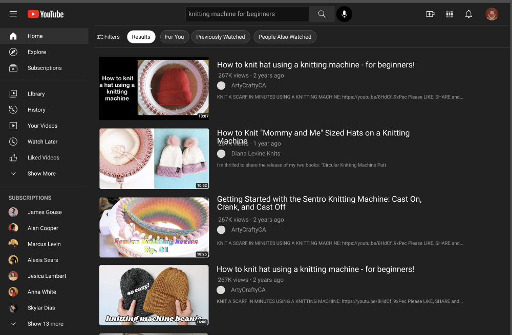
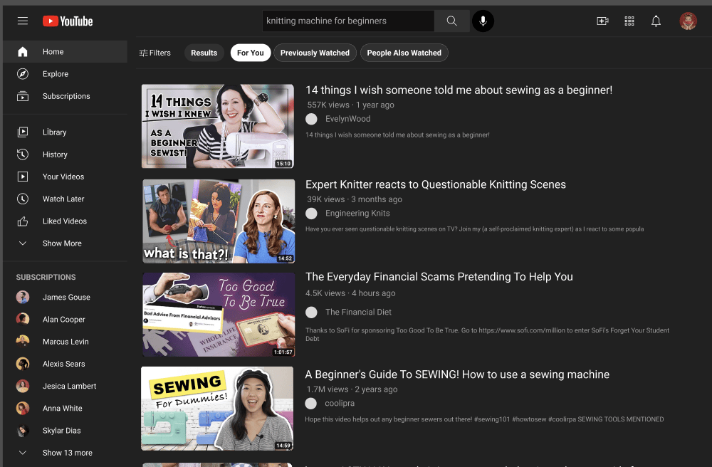
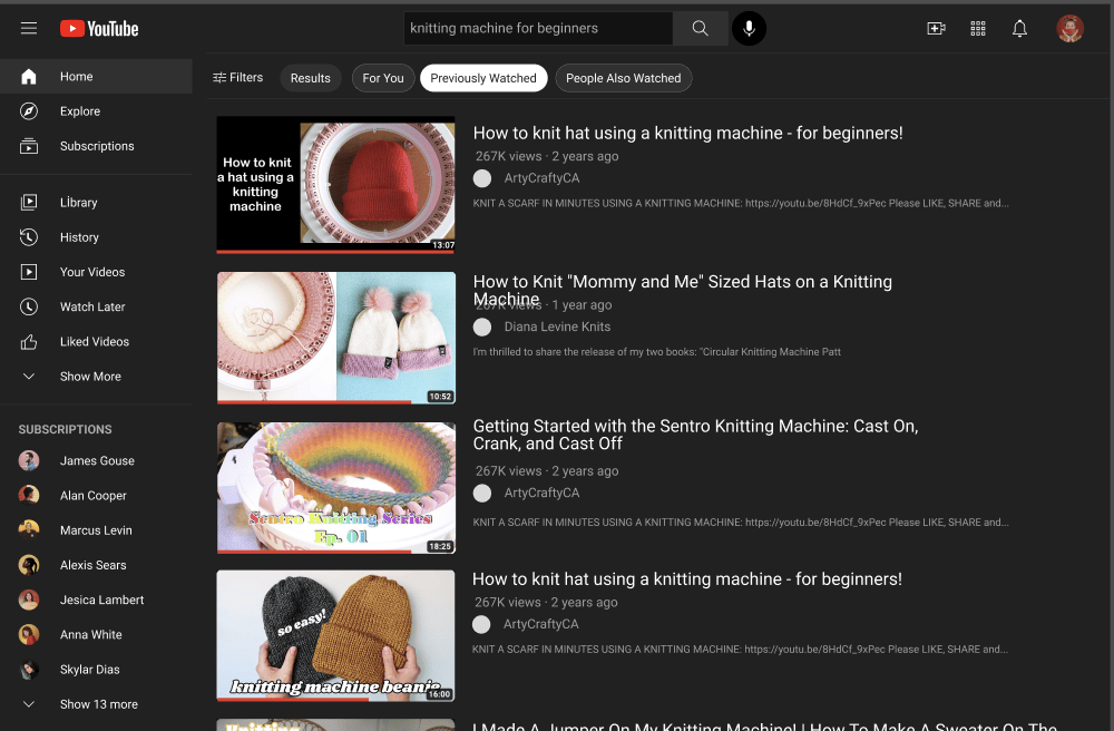
It's a small change, but the research made the case for it directly — the goal isn't to remove recommendations, which every participant still valued, but to stop asking someone to sort "did I search for this, or did YouTube recommend it to me?" on every single row of the same page.
Reflection
What I learned
- A journey map earns its keep when you compare more than one. Any single journey here might have looked like one student's bad day. Mapping five side by side is what turned "For You felt off" into a pattern I could act on with confidence — the dip showed up in the same place in every journey, regardless of what anyone was searching for.
- The best redesign is sometimes the one already sitting in the product. I didn't need a novel interaction pattern — YouTube's own home screen already demonstrated that tabbed separation works within its own design language. The research's job was to prove the problem existed and that this specific, low-risk fix addressed it.
- Competitive analysis explains root causes, not just features. Comparing YouTube to Vimeo, TikTok, and Twitch didn't just produce a features table — it explained why YouTube specifically struggles here: a library too large to recommend from without noise, paired with an algorithm tuned to keep already-large creators large.
- Designing inside someone else's design system is its own skill. Rebuilding the prototype with YouTube's actual components in Figma, instead of my own visual take, was a deliberate constraint — it forced every decision to be about information architecture rather than aesthetics, and made the final screens easy for anyone to evaluate as "would YouTube actually ship this?"